Project
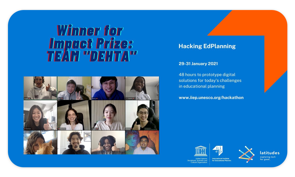
Hackathon
My Roles
UX/UI Design
Duration
48 Hours
Outcome
Interactive Prototype
UNESCO Educational Planning Hackathon
International 48–Hour Hackathon to build solutions for educational planning
Organized by IIEP UNESCO and Latitudes
The Challenge
A data visualization tool cross-referencing learning outcomes and factors that influence student performance to identify links, and contribute to ensuring that learning assessment data are integrated into the decision-making process and used in the most efficient way.
Test Zones: Africa and Latin-America
Our Solution
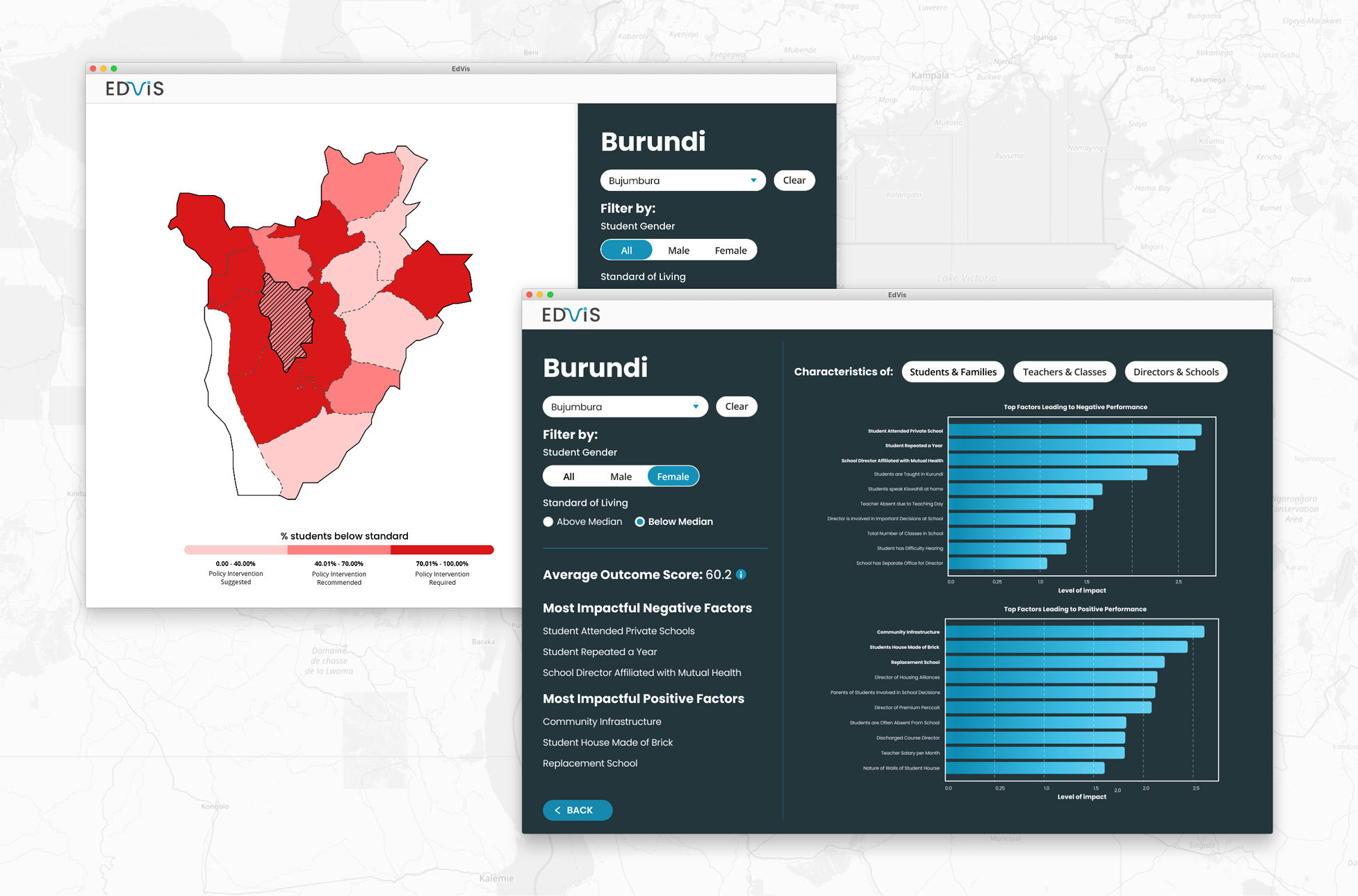
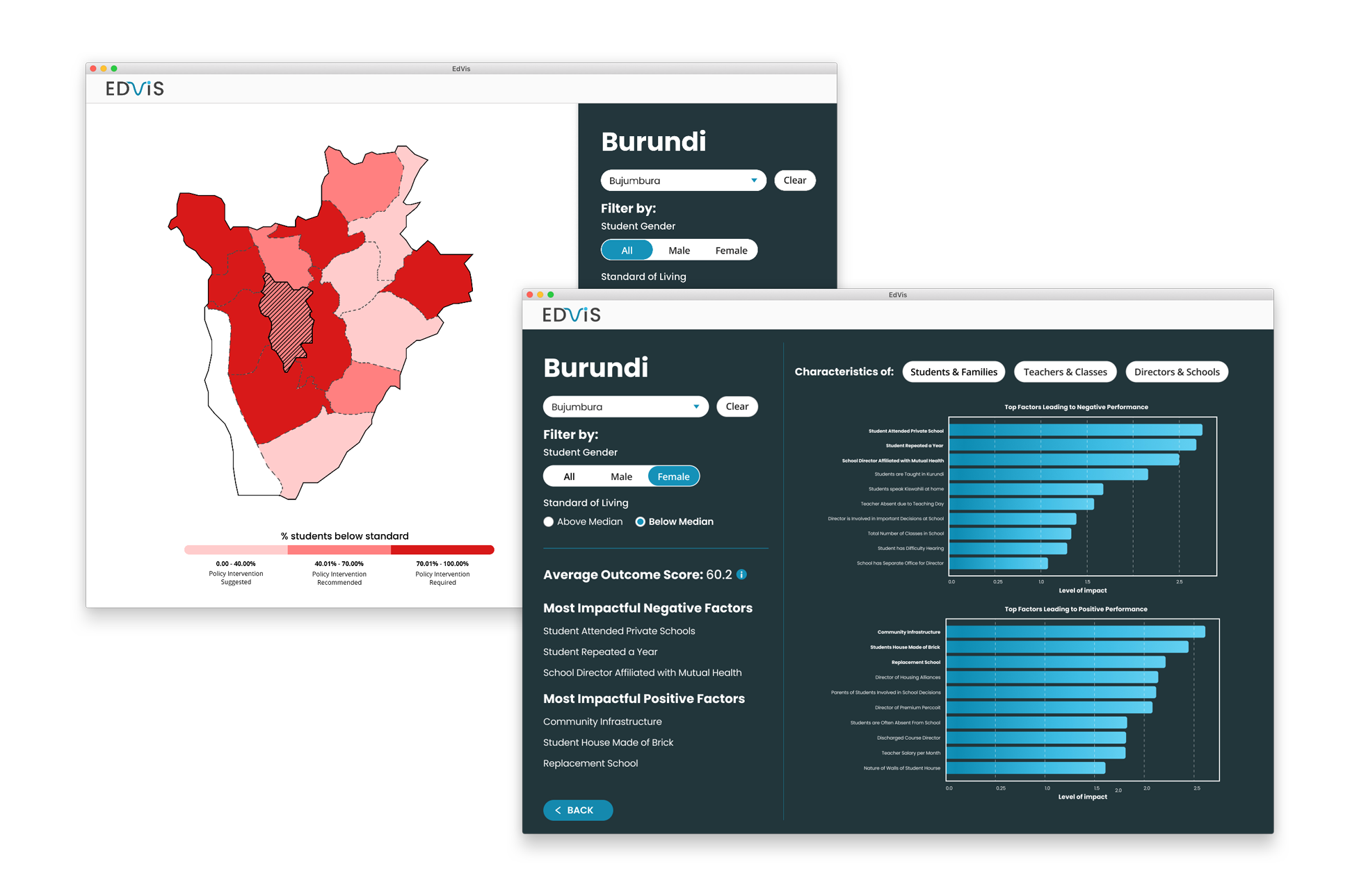
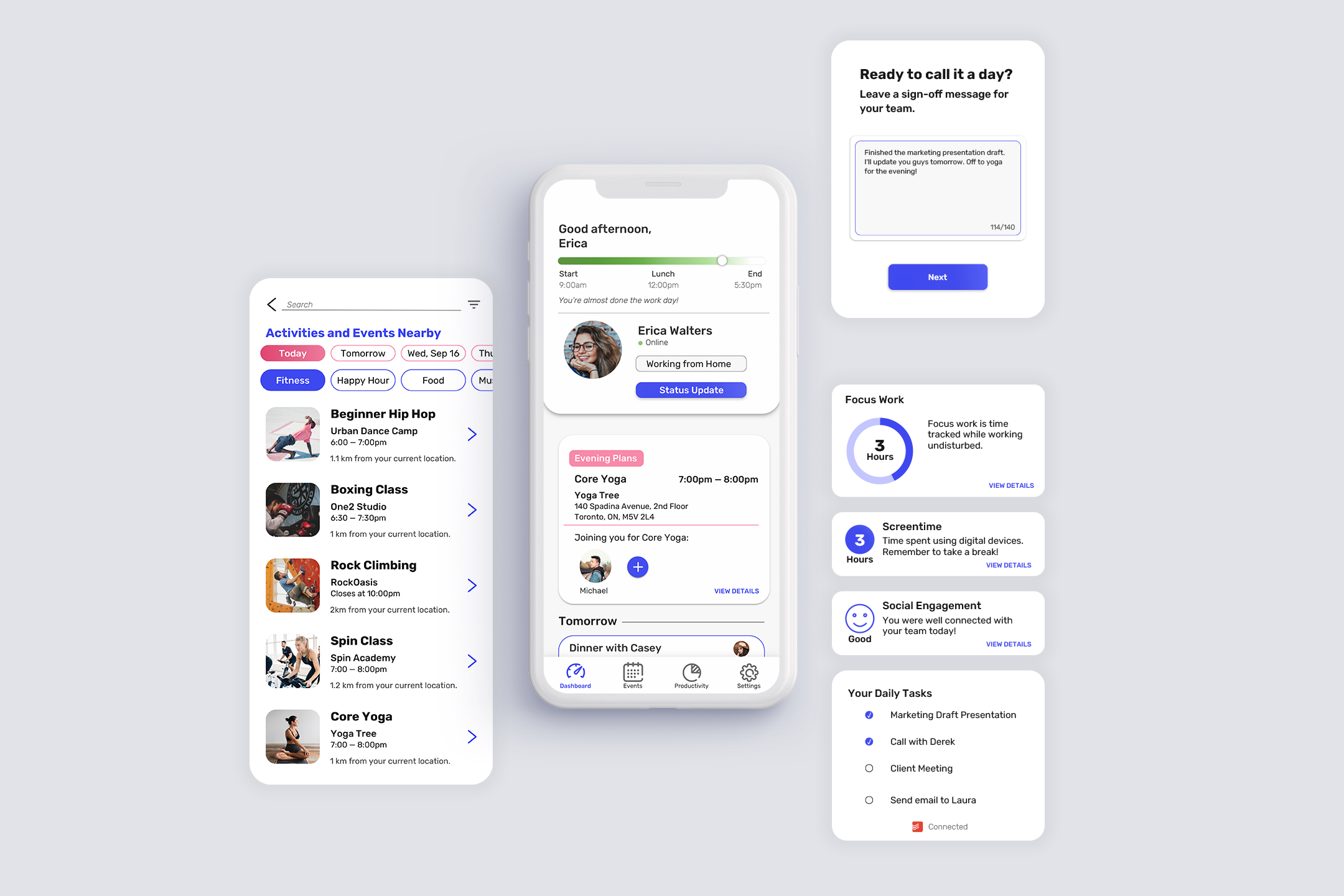
EdVis, an interactive dashboard to help educational planners better integrate learning assessment data for sustainable and equitable education systems. EdVis utilizes geospatial views and a user-friendly interface for stakeholders/actors at various levels.
What we accomplished
Our solution won the award for project impact! The jury recognized its potential to be implemented and its impact on education systems at large. Following the Hackathon's conclusion, we had the opportunity to chat with researchers at UNESCO on how the product could be further developed and utilized.
The Context
Setting the stage
Growing up in a first world country, we often take for granted our education systems. For many students around the world, schooling is not producing real learning outcomes. This global learning crisis can be evidenced by the lack of students reaching the minimum proficiency in reading and mathematics. Overall the quality and use of learning assessment data by educational planners is highly inconsistent and can be difficult to access.
Barriers to accessing learning assessment data include:
- Unfavourable political and institutional settings
- Lack of technical capacity to analyze results
- Ineffective channels to disseminate information
- Irrelevance of provided information
Digging deeper
Aside from the outline and brief that was given to us, we wanted to learn more about who the users would be for this product. Given the time constraint and inability to conduct user interviews, we instead spoke to the researchers leading this challenge and discovered a few key points to address.
- There are multiple levels of educational planners that would use this tool. From those at the national level all the way to the local administration. This range in users also results in a varying degree of technical know-how and understanding (this is where the UX/UI design comes in).
- A feature that could focus on different levels of the education system would be useful for planners (e.g. a school principal may find more use in viewing data at a district level rather than nation wide)
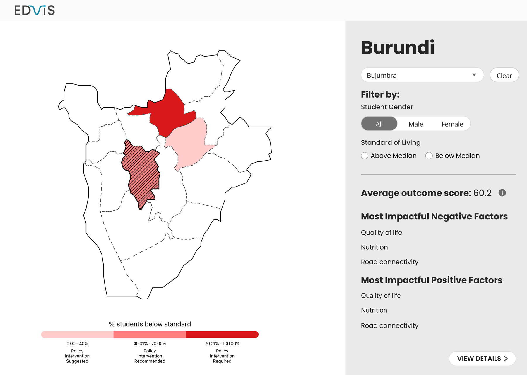
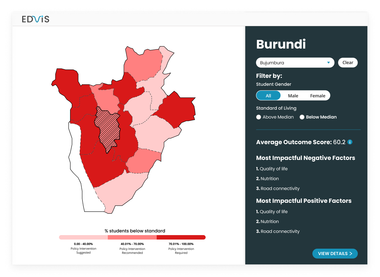
- There is a lot of data and factors that influence learning outcomes. The ability to filter out and focus on certain elements (e.g. gender, socio-economic income, housing conditions) was important to the final solution.
How might we help education planners use learning assessment data to easily identify and intervene in regions with poor learning outcomes?
Concept Development
Triage System
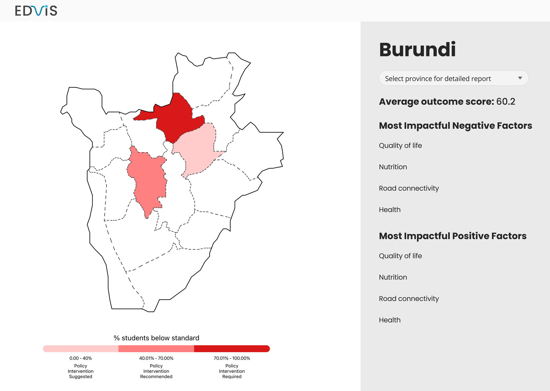
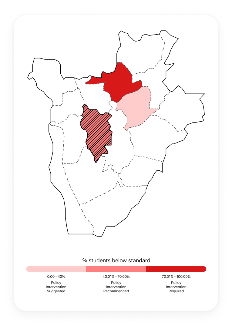
In discussion with our data scientist team members, it was clear that there was an abundance of information and the approach in which we presented it to users was critical. Taking inspiration from a triage system, we introduced a scale of urgency that would indicate which regions are in greater need of policy intervention compared to others.
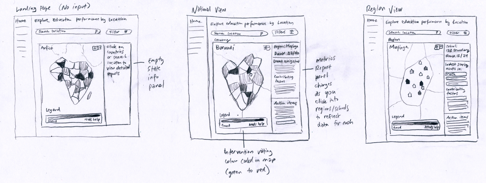
Geospatial View
Viewing data at different regional levels was important to identifying links between student learning outcomes and other factors. We chose a geospatial approach so that users can view information at different scales (from a nation wide view down to specific regions) in a familiar map interface.
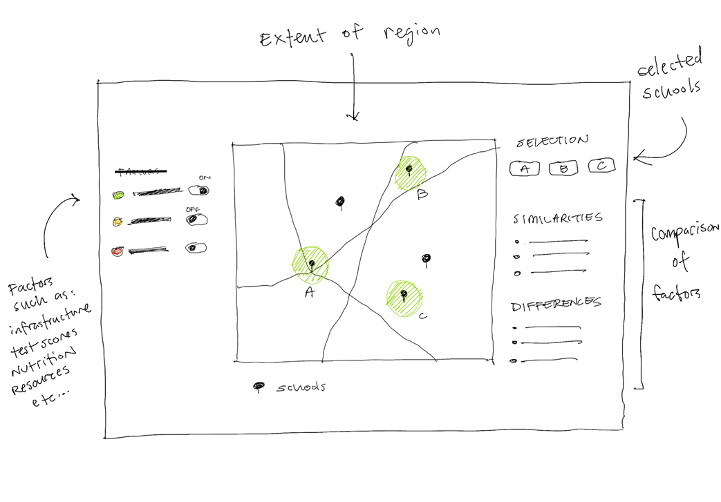
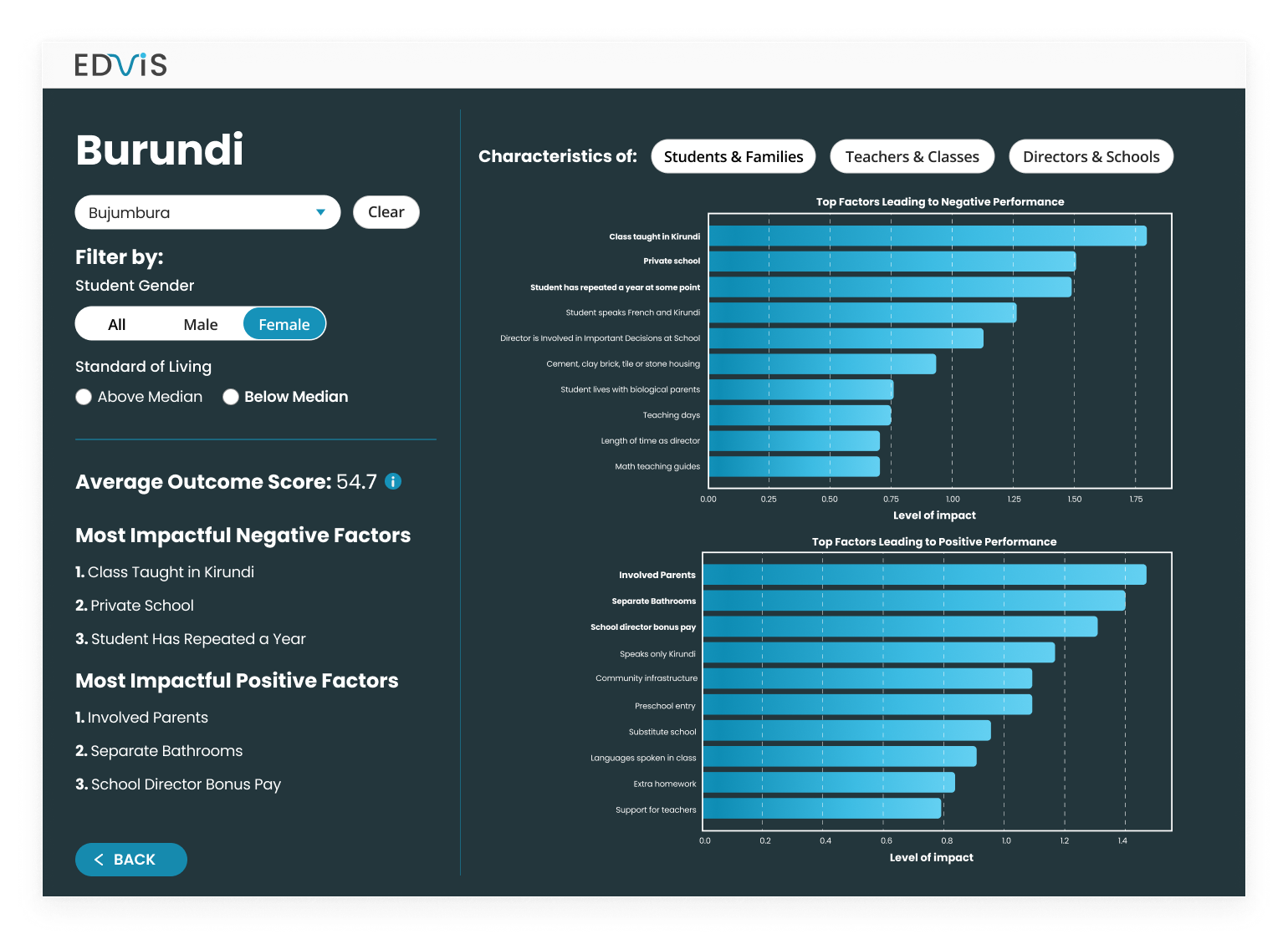
Displaying Key Factors
Our goal in the end was to empower users to make actionable insights with our tool. We explored methods to show top results, comparisons between data points, and ways to sort and filter information as a means to help users identify potential connections.
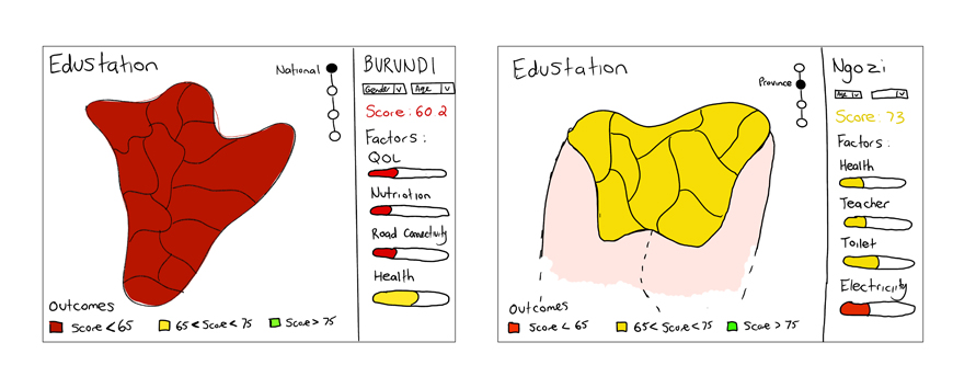
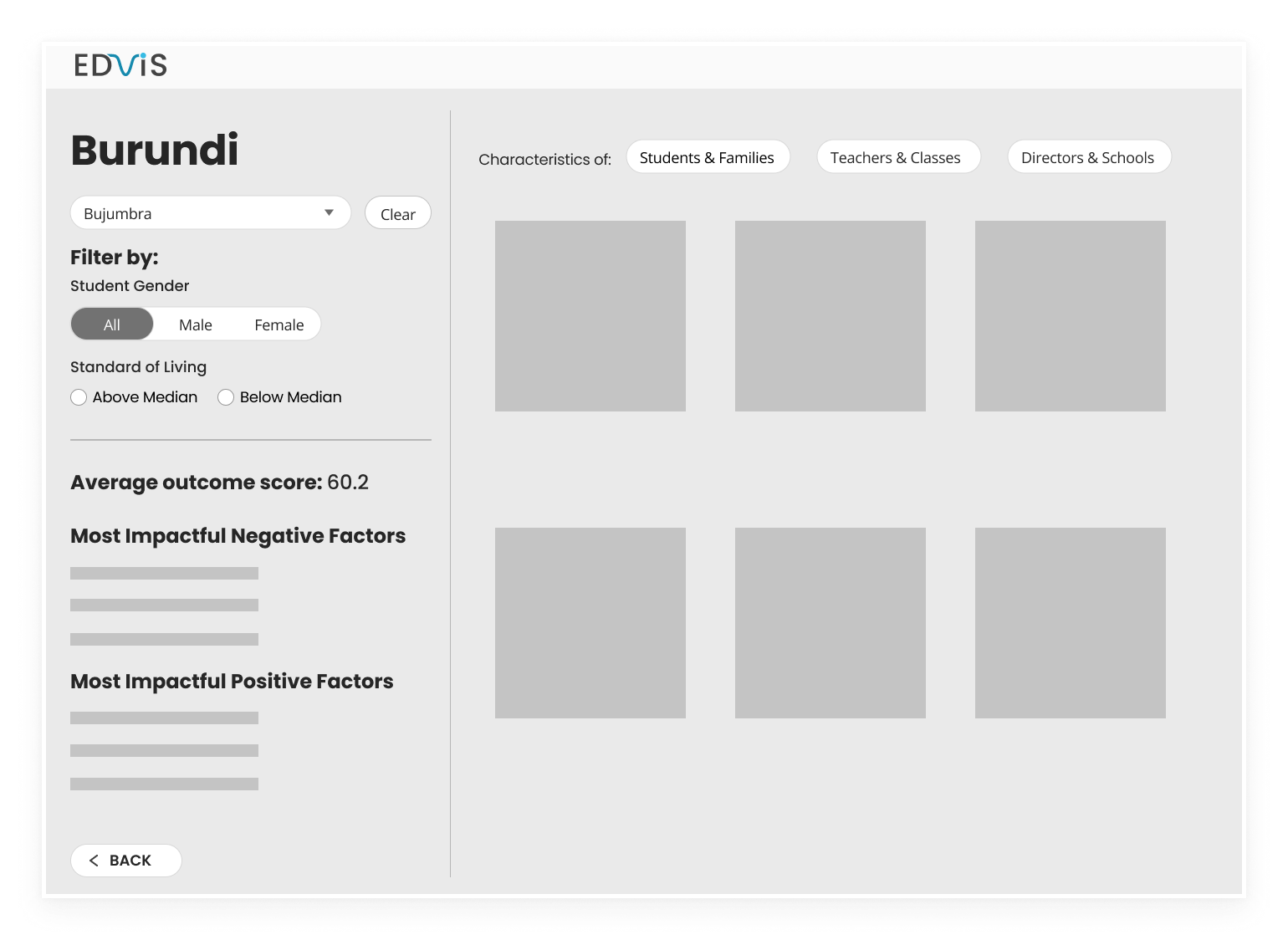
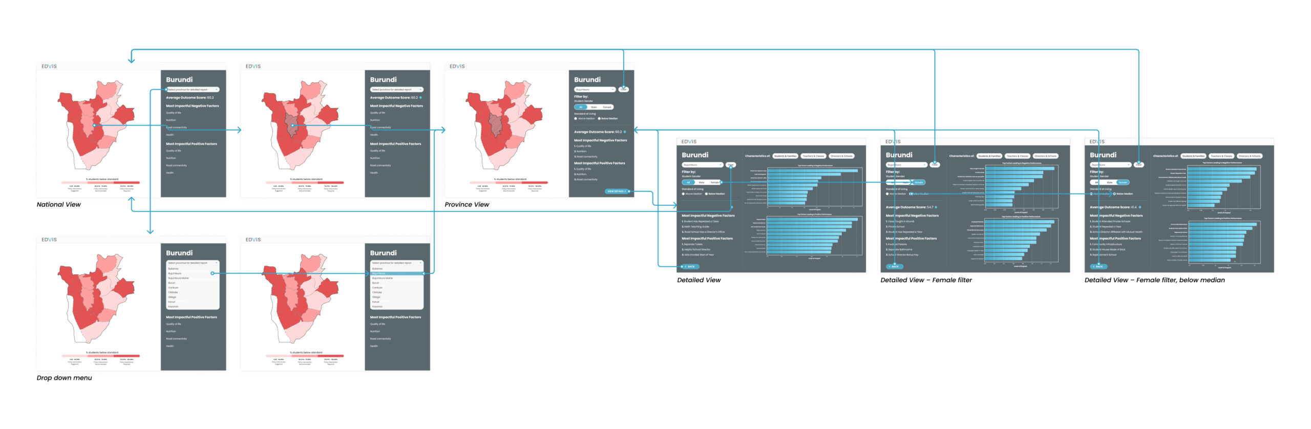
Medium Fidelity Mock Up
After discussing the ideas we came up with, we developed a medium fidelity mock up on Figma. This prototype helped to explain our ideas and concepts to the rest of our team and served as a reference for the web developers to work with.
User Interface
Colour and Urgency
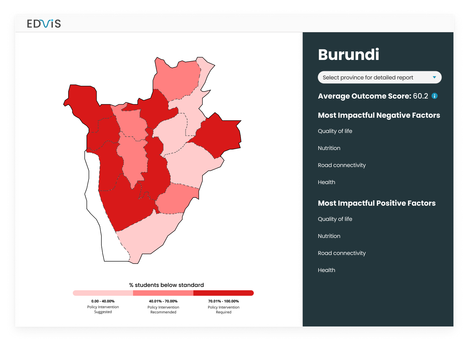
We used colour saturation as a means to indicate the urgency that a province needs intervention. Users can get a glance on a national level of what needs prioritization.
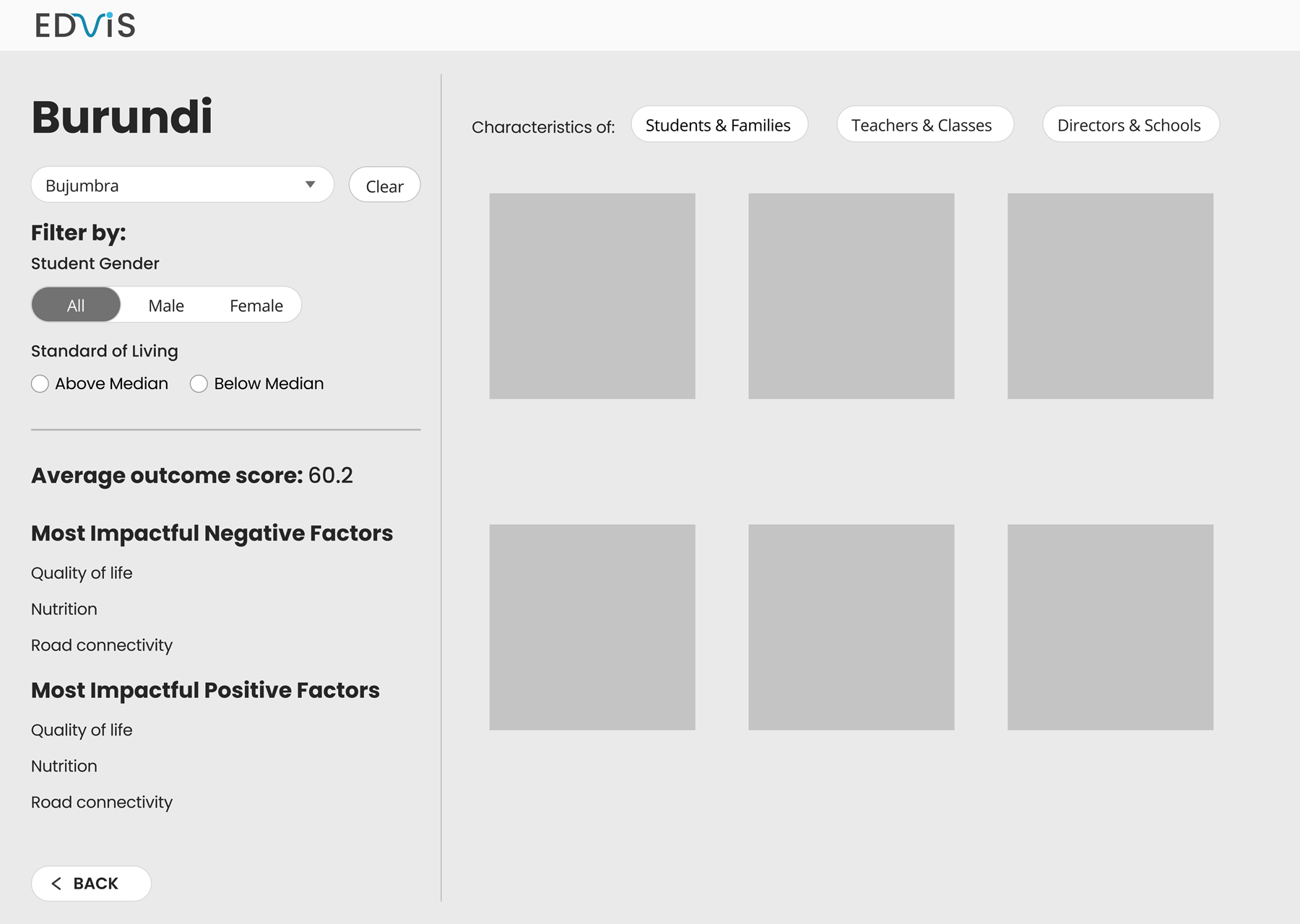
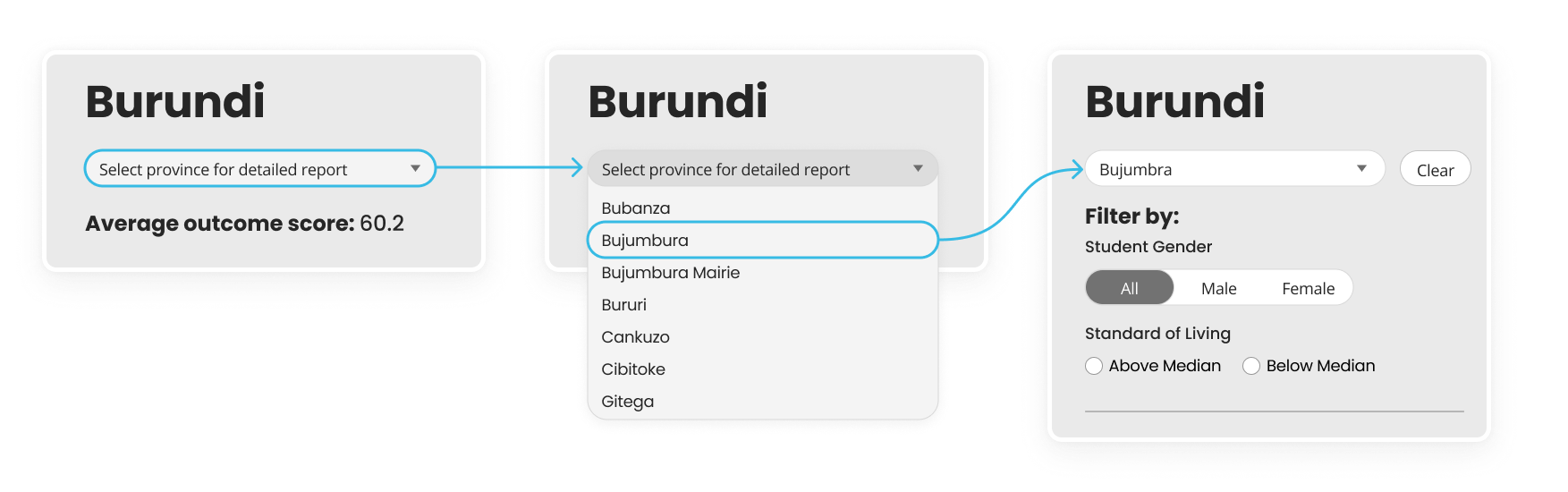
Province Selection
Including a drop down province selection gave users another way to select a province in case they were not familiar with the geography. Once a province is selected, more filtering options appear below.
Detailed View
In this detailed view, users can look at a more in-depth view of learning assessment data and generated graphs on the right side.
Prototype
By the end of the 48–hours, our solution to identifying links between student learning outcomes and factors that influence their performance was an interactive dashboard. Creating a high fidelity mock up along with branding elements resulted in a polished product that we could pitch to the jury.
Key Takeaways
Understanding more than your expertise
Multivariate linear what regression? Although my job as a UX/UI designer doesn't explicitly require knowledge of data science, I found it was beneficial to understand a bit about what my data scientist and web developer teammates were up to. In this case, I had to do some extra Googling and ask questions to stay informed. Being able to communicate with my other non-designer teammates helped to get a better understanding of their needs and concerns towards tackling the problem.
Designing for an International Context
In my career as a designer, many of the problems I tackled were within a local site or context. This challenge looked towards a potential testing zone in Africa and Latin-America. Some of the constraints that I wasn't aware of related to things like limited internet access, fluency with technology, and cultural factors. Participating in this hackathon was a great opportunity for me to think outside of the box and work towards a solution that can leave a real, positive impact on the global community.
Selected Works
UnplugProduct Design
CoastLineProduct Design

Sidewalk Labs: Proto–Model XArchitectural Design
WinterStations 2018: NESTDesign–Build