Project
Academic Case Study
My Roles
Research, UX/UI Design, Prototyping
Duration
10 Weeks
Outcome
High Fidelity Prototype
Design Process
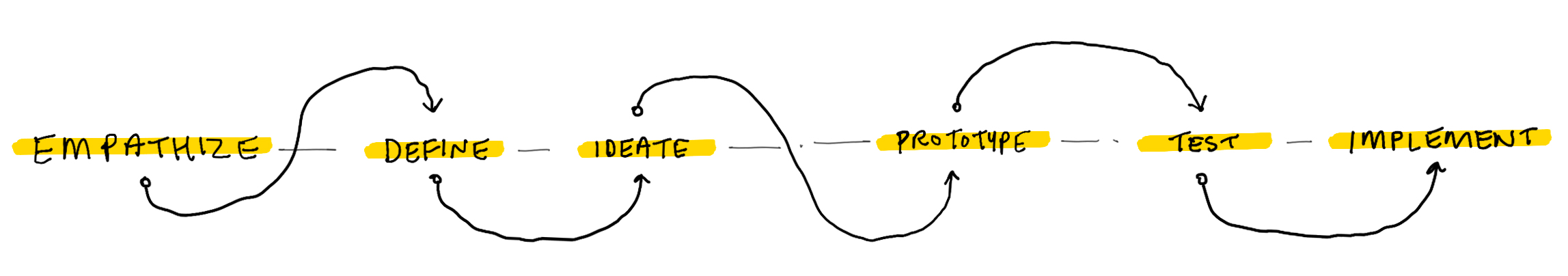
This project began by observing the world around me and identifying opportunities for a design intervention. My motivations were to create a product that could improve a user's quality of life. I explored different ideas and concepts in an iterative process, taking steps forwards or backwards as I verified my design decisions through user feedback and usability testing. The final outcome was a high fidelity prototype that can serve as a proof of concept for additional iteration.
My Toolkit
The tools and software I used for this project were Sketch, Photoshop, InVision, and of course – pen & paper.

EMPATHIZE
Problem Space
The Global Context
In March of 2020, the World Health Organization declared the COVID-19 viral disease a pandemic. At the start of this capstone project in July 2020, it was clear that this novel coronavirus has impacted the world and affected our day to day lives. As public buildings, restaurants, and office spaces closed for lockdown, a shift towards remote work presented new challenges and issues for the office worker.
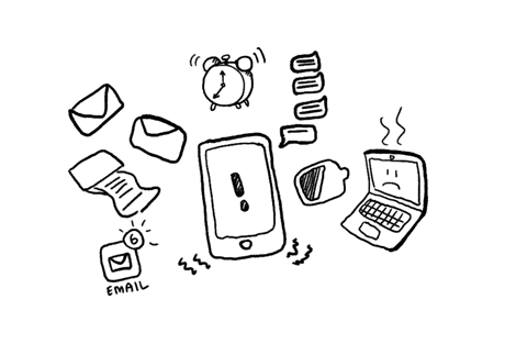
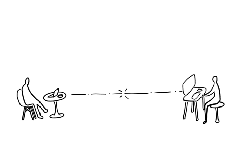
Teleworking
Telework is a trend that is growing rapidly as evidenced by dramatically reduced office occupancy and a more than a 100 percent increase in regular telework (at least one day per week) since 2005. A shift towards this remote working culture presents new challenges for telecommuters around human interaction and blurred lines between work and personal life.

Project Constraints
With physical distancing constraints in place, the entirety of this project had to be completed remotely. This made it challenging to meet with educators and peers for feedback. This constraint was also an obstacle when it came to conducting user interviews and usability testing. Communications were entirely remote and done through voice and video calls.

Project Goals
– Develop a meaningful digital product that can help teleworkers maintain a healthy balance between work and personal life.
– Empathize with users to translate real world problems and concerns into design decisions.
– Apply design thinking and become familiar with the User Experience design process.
EMPATHIZE & DEFINE
Research Process
Primary & Secondary Research
The Future of Work
To develop a greater understanding of the problem space, I began by looking at existing research and publications on the state of remote work and the future of office spaces.
The Role of Office Spaces

A shift towards remote work will ultimately impact the usage and design of office spaces. I reached out to my network and scheduled a coffee chat with a design director from Gensler, a global design and architecture firm, to gather some insight on the future of office spaces.
Gathering Data
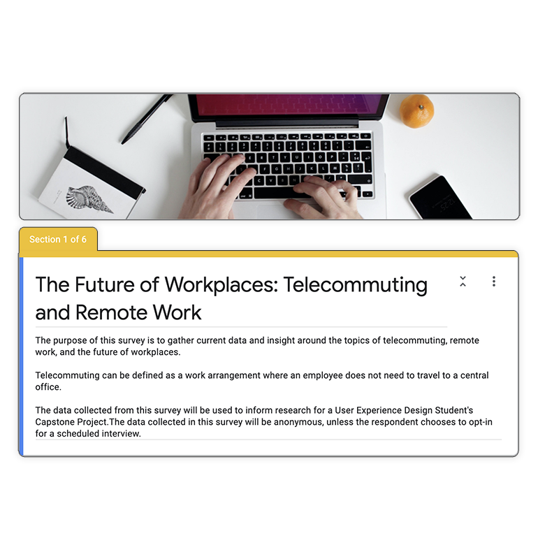
I conducted a survey to gather more insight on telecommuting and how respondents felt about their productivity, communication, and social interactions while working remotely. This survey received about 100 responses, many which were within my target user demographic.a
User Interviews

From the survey that was sent out, I was able to organize more in-depth interviews with select respondents. This helped to investigate how users felt about their current work lifestyle and if they were open to embracing technology as a digital solution.
Key Research Insights
Survey Results


A majority of survey respondents felt it was difficult to unplug and disconnect after work hours. Some respondents also noted that it was difficult to focus on a task while working remotely.
When does your work day end?
From my user interview findings, a common pain point was the feeling of a blurred line between work and personal life. Other issues included challenges in completing certain tasks remotely and working in small spaces (e.g. bedrooms or living spaces)
“Physical distance equates to emotional distance"
Working remotely has been an option for years. The trust in empathy is key for innovation. Face to face interactions are an important aspect of this, it’s the trust that you build with colleagues that is important and not your levels of education or experience.
DEFINE
How Might We
Putting all of this research together along with insights from my survey and user interviews, I was able to have a better understanding of remote work. Telecommuting has been a rising trend, and with the 2020 global pandemic that is unraveling, the need for re-evaluating our relationship with work is vital.
How might we help telecommuters achieve a healthy balance between work and life so that they feel empowered and less disconnected?
EMPATHIZE & DEFINE
Analysis
User Persona
Creating a persona helped to synthesize all of the research data and insights into a tangible and understandable form. Erica, our fictional persona, helps to represent the motivations, pain points, and behaviours of our target demographic.

Experience Map
This experience map helped to illustrate and visualize what Erica’s experience might be like while working remotely. It takes a look at the environment around her, how she is feeling, what she interacts with, and opportunities for design.

DEFINE
Core Value Proposition
At this point, I had key research insights, a persona that represented my target users, and a better understanding of the teleworking experience. From here I was able to begin thinking about my core value proposition and what my minimum viable product would be.
This product strives to help users develop a healthy work and lifestyle balance by properly disconnecting from the work day and staying socially connected.
IDEATE
Concept Development
Core Epic & User Stories

The user epics and stories that I explored addressed challenges related to communication, productivity, and disconnecting. What I ended up focusing on for a core epic was on helping users unplug and disconnect. This is the most compelling narrative because it’s representative of the greatest challenges when working remotely as discovered from my research.
Task Selection
Moments of Intervention
Now that I have an idea of what types of features and solutions I could explore, I thought about when the user would use this product.
Where are opportunities throughout the day for telecommuters to use the product?

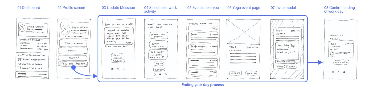
Task Flow Diagram
Core Task: As a telecommuter I want to change my status and select an afterwork activity so that I can let my team know I am done for the day and disconnect.

IDEATE
Concept Design
Low–Fidelity Concept Sketches
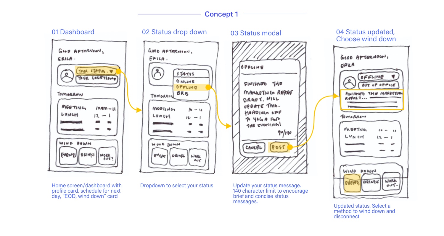
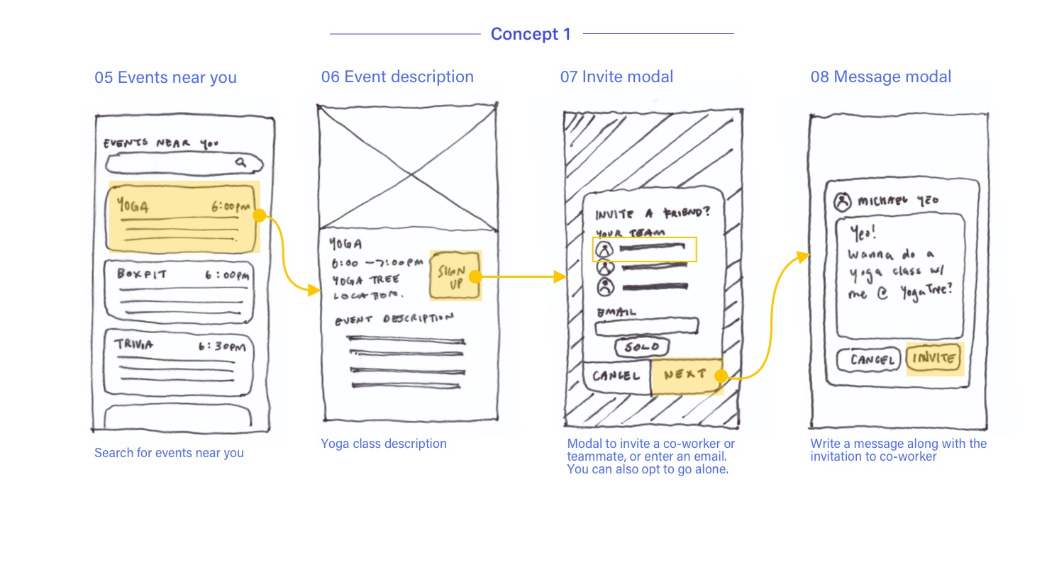
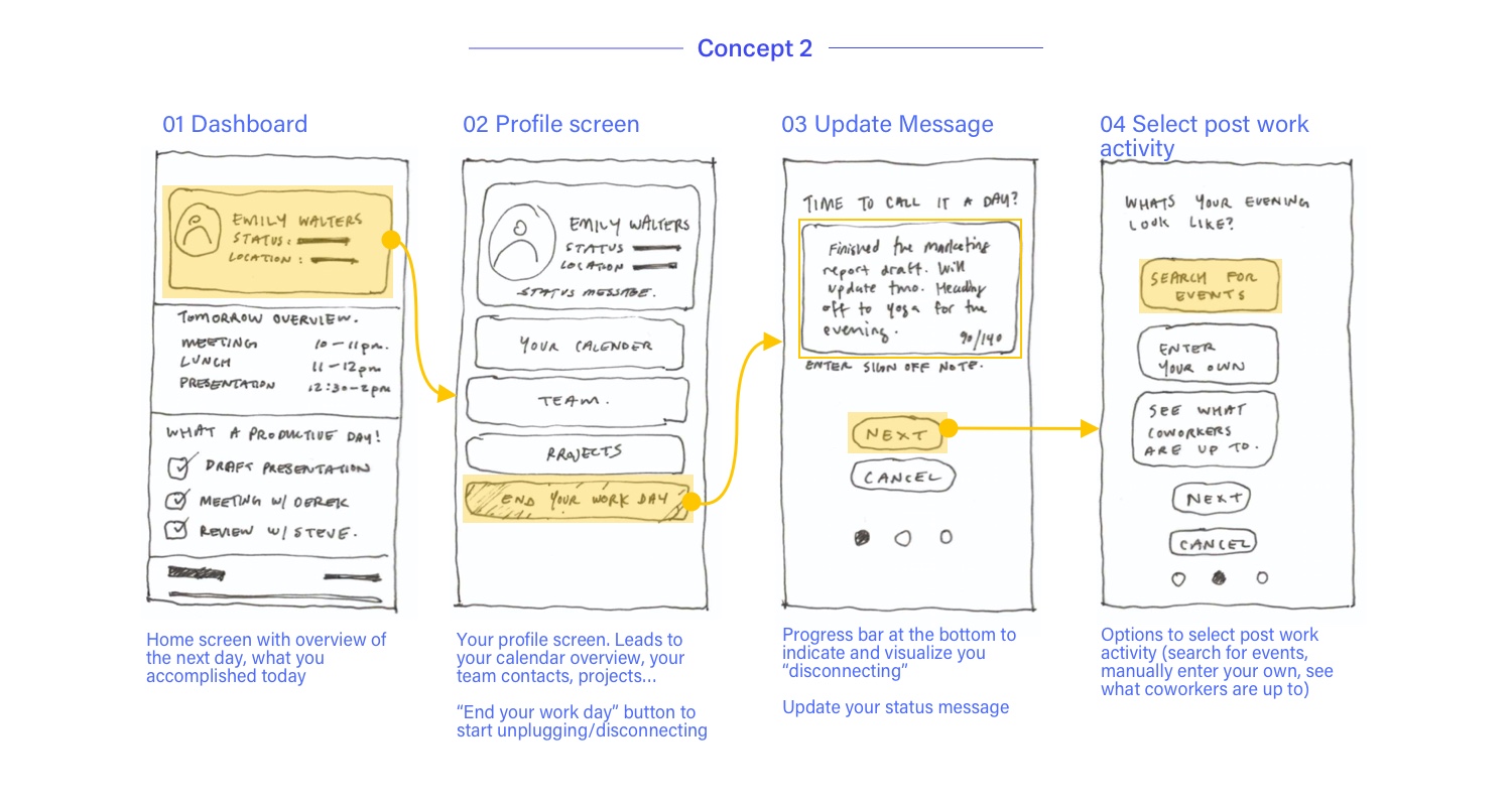
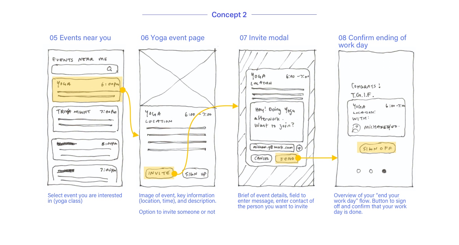
Concept Refinement
The concept I decided to develop was the second concept. This wire-flow was interesting to me because of the step-by-step, screen to screen flow that occurs after the user presses the “End your day” button. Indicated by the progress circles, this concept creates an almost ritual like experience for the user when they decide to sign off using the app.
PROTOTYPE
Medium–Fidelity Prototype
Producing a medium fidelity prototype was the next step in translating my analog sketches into the digital space. I took this opportunity to begin thinking about basic visual elements and the user interface. Working at this fidelity level helped to stay focused on functionality rather than pixel perfect visuals (that’ll be for later).

Grayscale Palette
Using only grayscale helped to work out the visual hierarchy of each element before injecting colour in the later stages. For the purpose of usability testing, I also attempted to select shades of gray that would not cause contrast issues with white or black text.

Cards and Depth
I decided to use cards and a rounded language for my user interface so that I had a flexible system to work with. Each card can have varying levels of visual depth and information content depending on the usage.

Interface Elements
Working in medium fidelity, I started to introduce elements that helped relate back to the product features and user stories. Progress bars helped give user’s a visual indicator of time. Pills helped to suggest filtering options for event searching.
TEST
Usability Testing
Using the medium fidelity prototype, I was able to begin my first round of usability testing. This was a process that served as an opportunity to verify my assumptions and challenge my design intentions with real users in my target demographic. Receiving direct feedback from users gave me insight into the functionality of the prototype and helped me gain a greater understanding of the problem space.
Context & Tasks
The usability testing began with a short brief about the project and the purpose of the usability testing, emphasizing that the exercise was about testing the prototype and not the user themselves. I then asked some general questions for background information and tasked each user with 5 specific tasks to complete.

Overall Testing Results (Version 1)

Priority Matrix
Given the timeline of the project, it was important to review all of the feedback and summarize them into key insights. To help focus on which issues were important to address first, I created a priority matrix that helped to identify key changes in relation to the time and effort it takes to resolve them.

Resolving Usability Issues
After applying these changes, I developed a Version 2 of my prototype for another round of testing. Conducting these usability tests were invaluable to the design process. An idea or course of action that is obvious to the designer may easily be misinterpreted or cause confusion to a user. Listening to user feedback and observing their behaviour helped to resolve usability issues like the one below.


Heuristic Evaluation

Potential Heuristic Violation: User Control and Freedom
Before I began user testing, I noticed a potential issue with this prototype. In the above wire-flow, all of the above screens happen within the Dashboard navigation tab. If a user were to accidentally exit this flow in the middle of the process (e.g. by clicking another navigation tab) — how would the user return to their previous screen in the wire-flow?
To investigate this potential violation, I took a look at the Instagram ‘Explore’ tab. In these wire-flows, content within the ‘Explore’ tab stays within the tab. If a user were to click another tab, such as Profile, once they return to the ‘Explore’ tab they will be at the same screen they left off at. This concept can be implied in my prototype by having a ‘Dashboard’ tab that is in a constant active state throughout the wire-flows.

IDEATE
Visual Design
Inspiration
Product Keywords, Feelings, Adjectives
To kickstart the creation of a visual identity for this product, I began with brainstorming words that helped to shape what this product and brand would be.

Moodboard
Along with words, images also helped to define a mood and atmosphere for the product. The feeling I was trying to invoke with this moodboard was something that was a pop of colour, punchy, and exciting. After a few board iterations and colour extractions, this is the moodboard that I felt reflected the idea I had.

Colour Palette
Using the direct colour extraction as inspiration, this was the colour palette I decided on. The intention was using the primary and accent colours to bring emphasis to important elements and using the neutral shades to curate a minimal look with a pop of colour.

Typeface
The selected typeface was Rubik. I choose this typeface for the clear and legible glyphs, rounded corners, and balance between casual and professional look.

Branding
With a greater understanding of what this product could be, I began to generate a list of potential names and watermark design ideas. I explored different ideas relating to fills versus outlines, graphic glyphs, positive and negative spaces, and began to introduce colour. After some peer reviews and feedback, I then started to narrow down on specific concepts and colour combinations.
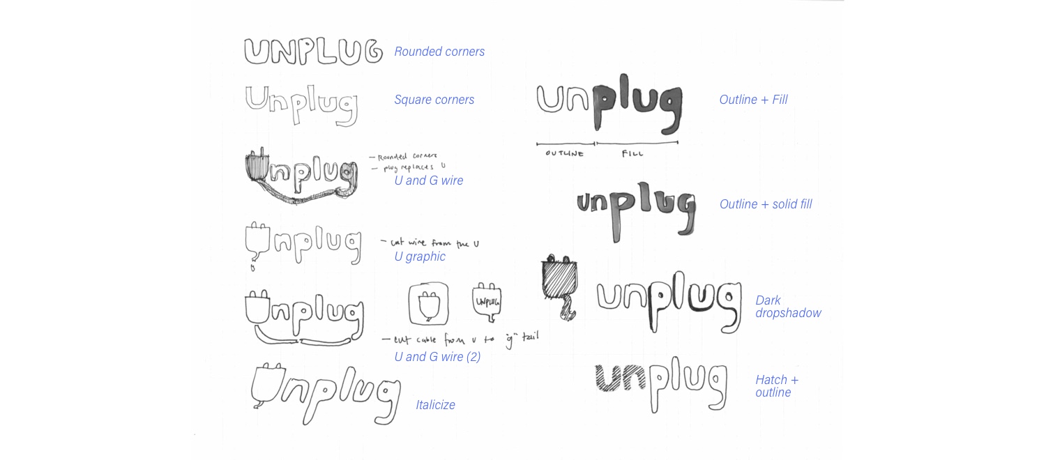
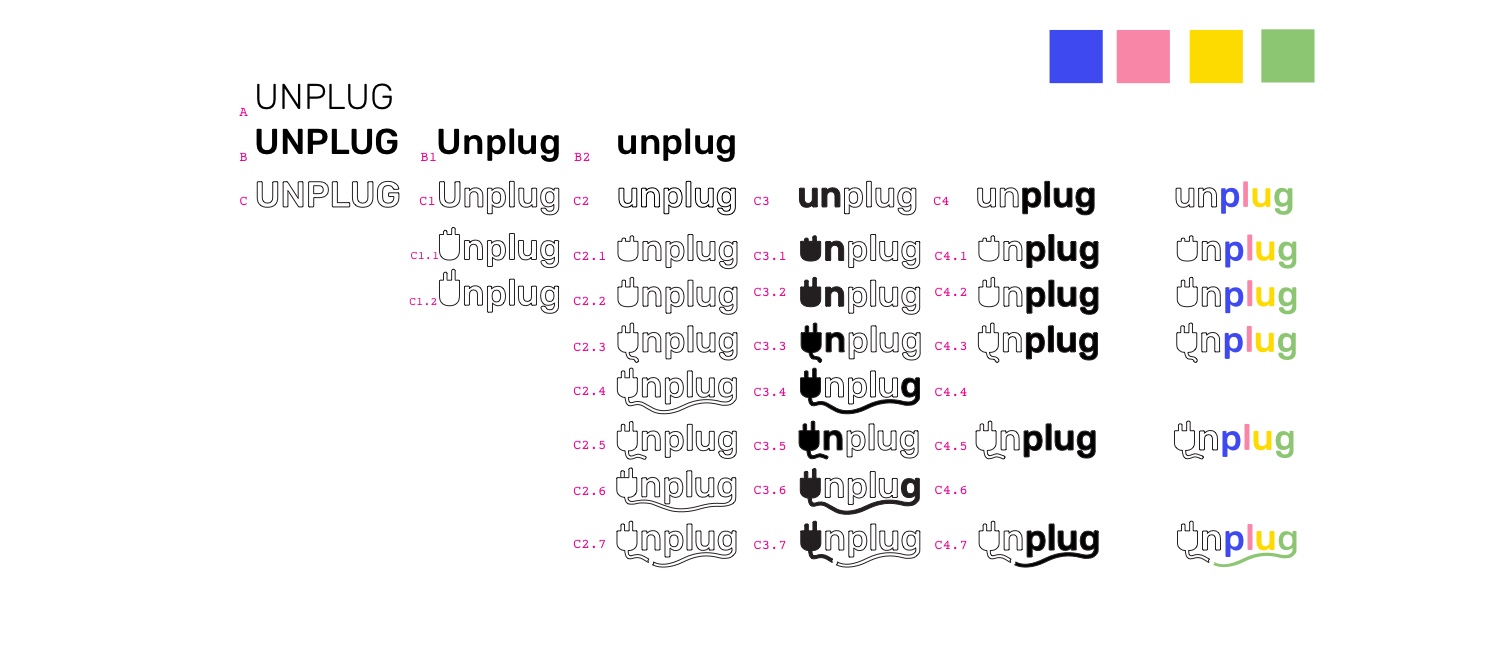
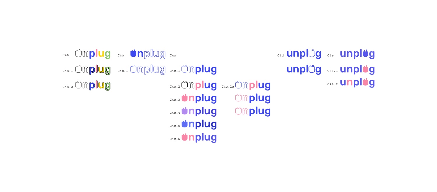
Although I wanted to include more colours in my design, it proved to be a challenge to balance more than one colour at a time. I chose a version that was simple, without any extra ornaments, and using the primary colour only.

PROTOTYPE
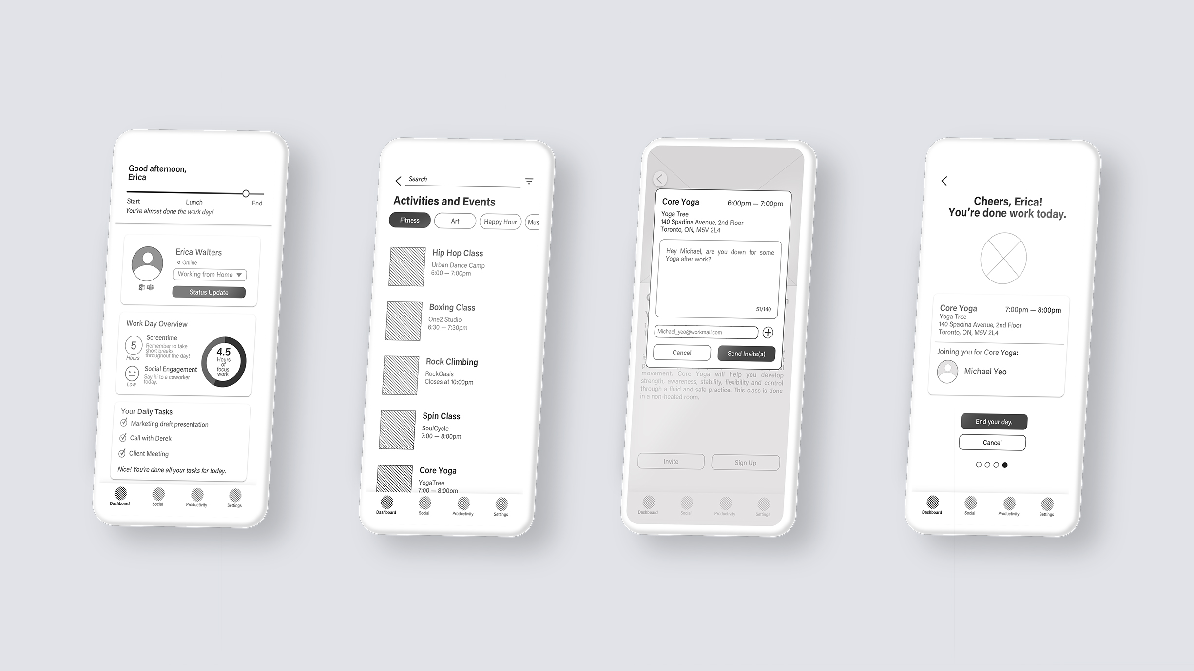
High–Fidelity Prototype
After completing two rounds of user testing, visual design explorations, and branding exercises, I created a high-fidelity prototype.
The primary task flow is to search for an event (try Yoga), invite a co-worker to join you, and end your work day by signing off and letting your team know you're done for the day.
IMPLEMENT
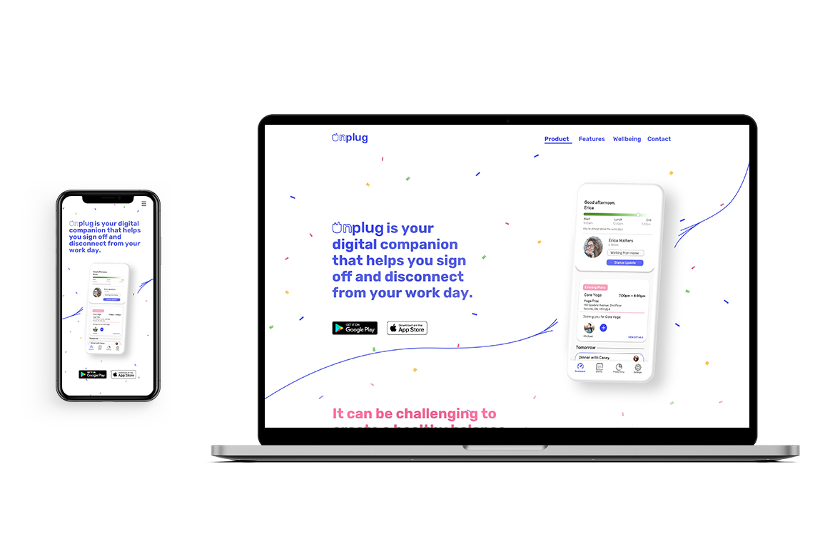
Marketing Website
Building on the visual design elements and branding, I designed a product marketing website for Unplug. I took this as an opportunity to imagine how the product could be discovered by a user. I approached this with responsive web design in mind, making sure that the content would be optimized for both mobile and desktop.
Moving Forward
Next Steps
1. Conducting more usability testing
Using the high fidelity prototype, I would conduct another couple rounds of usability testing to make sure there are no more major issues and that users understand the core value of the product.
2. Introducing a Secondary Task Flow
Digital wellbeing is an important aspect that I want to raise more attention to. Given more time, I would like to explore features that can remind users to take periodic breaks in their work day. Perhaps this could be setting timers or looking at opportunities to notify users about their screen time and productivity.
Key Learnings
1. Avoid asking leading questions
When conducting user interviews or doing usability testing, it’s important to ask questions that give insight into what someone is thinking about. It’s important to avoid asking leading questions so that you don’t project any of your assumptions or bias onto the user.
2. Time & Energy Management
Something that I had to remind myself constantly throughout this project timeline was if a deliverable was realistic to accomplish in 10 weeks (while also working on other course assignments). I tend to spend lots of time working out small details to perfection and can sometimes overlook the larger picture. Creating priority matrices and being more cognizant about my timelines helped me to work on improving my efficiency.
3. Designing for people.
As a designer, it’s tempting to overlook feedback (either from a user or a peer) that you don’t agree with. Reviewing interview notes and key insights periodically helped remind myself to re-align my design intentions with the intended user.
Selected Works
EdVisHackathon
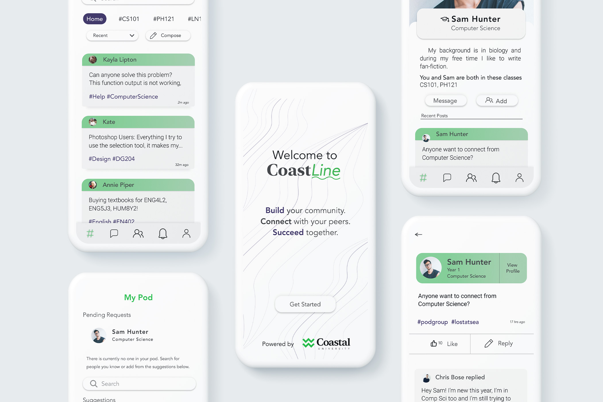
CoastLineProduct Design
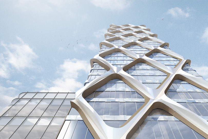
Sidewalk Labs: Proto–Model XArchitectural Design
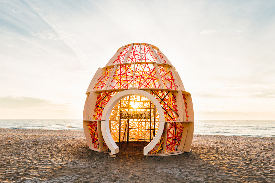
WinterStations 2018: NESTDesign–Build
/
/
© Henry Mai 2024